
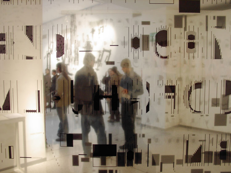
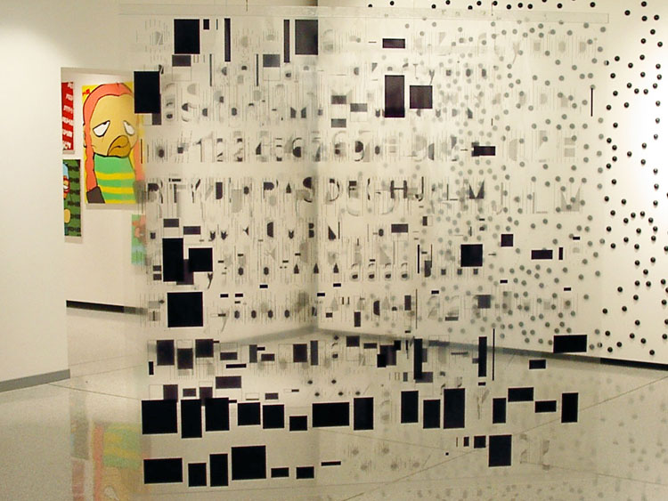
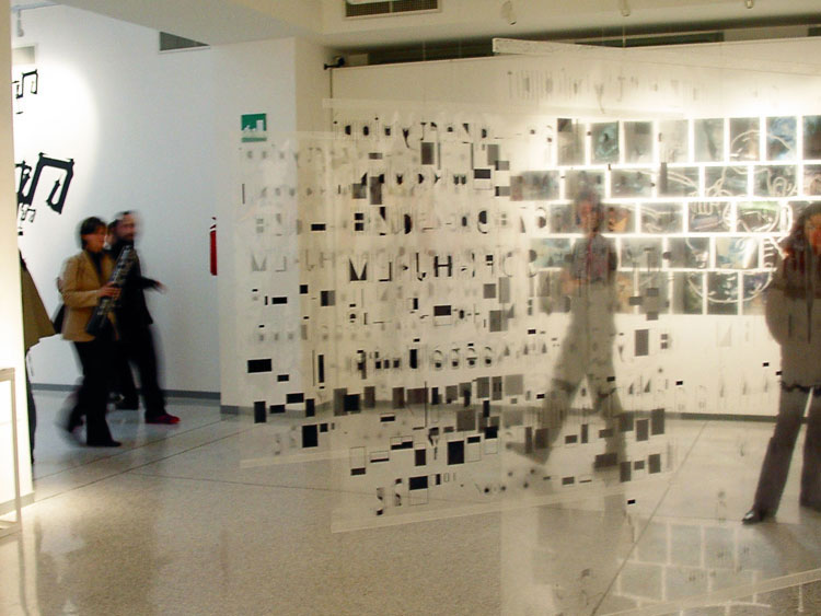


Transparency Type Installation
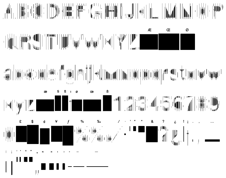
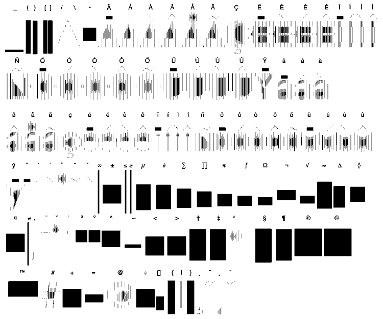
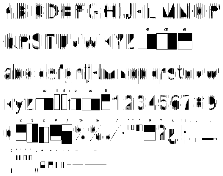
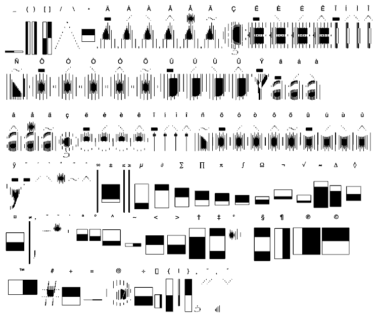
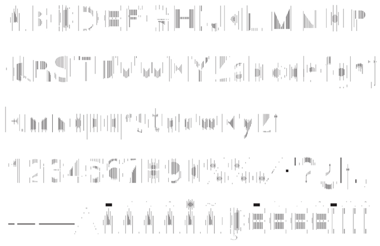
TRASPARENZA (1996) Trasparenza come concetto e come segno. L ’idea nasce dalla lettura della legge italiana sulla trasparenza 241/90. Tale legge si occupa delle relazioni tra cittadino e pubblica amministrazione. Parallelismo con la font: trasparenza come concetto -negazione -affermazione -identità mancata – contraddizione in termini. Nelle font Trasparenza e Semitrasparenza – l’intermittenza tra presenza ed assenza delle linee verticali, crea una struttura sottile di 4 griglie – dove ci si può guardare attraverso – dove i diversi valori di trasparenza dipendono dalla rarefazione di questa. Nelle font si propone una dualità tra trasparenza e non trasparenza. Nelle restanti parti della tastiera gli ingombri geometrici dei simboli vengono sostituiti con le “Lies ”:figure geometriche non trasparenti (o semitrasparenti nel caso della font Semitrasparenza).
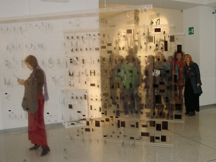
TRANSPARENCY (1996) Transparency as concept and as design. The inspiration for this font springs from a reading of the Italian law on ‘transparency’ (no.241/90), a law which deals with he relationship between citizens and public authorities, and the principle of open and accountable government. The font however is concerned with transparency as concept; as negation and affirmation; as mistaken identity and contradiction in terms. In the fonts “Trasparenza” and “Semitrasparenza” we find that the alternation between the presence and absence of the vertical lines creates a structure that is see-through; in which the different degrees of transparency originate from the relation between and the superimposition of 4 ‘grids’ of different sizes. The font contains a duality between transparency and non-transparency. The remaining parts of the keyboard are composed of ‘lies’; non-transparent or semi transparent blocks whose dimensions correspond to those of the symbol you would normally expect to find there. The grid of “Trasparenza” is also the basis for the fonts “Omission”,“Semitrasparenza”: as well as being 2 variations of this first font, they also represent its 2 extremes, in their omission of certain lines and the horizontal expansion of others.